
With over 93% of handset owners in Ireland now using a smartphone, your website isn’t just a digital business card; it’s a mobile storefront that never closes. You likely already know that a clunky mobile experience is the fastest way to lose a potential customer to a competitor. It’s frustrating to watch high bounce rates climb whilst you struggle to maintain multiple versions of your site or see your search rankings slip because your layout doesn’t adapt. You want a site that looks brilliant on a laptop in a Dublin office and works perfectly on an iPhone in a Cork café.
Our professional responsive web design services transform these technical hurdles into your greatest competitive advantage. This guide will show you how to build a high-converting, mobile-first powerhouse that satisfies Google’s latest indexing rules and boosts your Meta ad performance. We’ll explore the essential 2026 strategies for seamless user experiences, improved SEO rankings across Ireland, and the technical shifts that turn casual scrollers into loyal customers.
Key Takeaways
- Learn why fluid grids and CSS Grid have replaced rigid layouts to ensure your brand looks professional on every screen size, from smartphones to desktops.
- Understand how Google’s complete transition to mobile-first indexing dictates your visibility and ranking potential amongst Irish consumers.
- Discover how professional responsive web design services create the high-performance foundation needed to maximise conversions on Google and Meta ads.
- Realise the benefits of a mobile-first roadmap that prioritises core functionality and lightweight assets like SVGs for lightning-fast load speeds.
- Identify the criteria for choosing a Dublin-based partner who can synchronise your custom web design with SEO and video production for a cohesive digital strategy.
What are Responsive Web Design Services?
Professional responsive web design is an approach where a single website fluidly adapts its layout to fit any screen size. Gone are the days of building separate mobile sites or forcing users to pinch and zoom on a desktop layout. Modern responsive web design services ensure your site looks intentional on everything from a five-inch smartphone to a twenty-seven-inch monitor. This shift from fixed, pixel-based layouts to the “fluid grid” concept allows elements to resize proportionally. We now embrace a Mobile-First philosophy, designing for the smallest screen initially to ensure core functionality remains prioritised before adding complexity for larger displays.
It is a common misconception that these services only cover the visual aspect of a site. In reality, they encompass a deep integration of design and development. The visual team creates the flexible interface, whilst the development team writes the complex code that allows the site to “breathe” and adjust in real-time. This dual approach ensures your brand remains consistent and functional, no matter how your customers choose to browse.
The Core Components of a Responsive Site
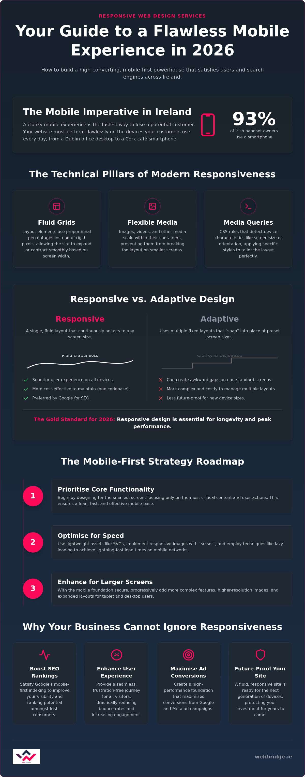
To truly understand What is Responsive Web Design?, you must look at the technical pillars that hold it together. These three elements work in harmony to create a seamless experience:
- Fluid Grids: Instead of setting a sidebar to a rigid width of 300 pixels, we set it to a percentage, such as 25%. This allows the layout to expand or contract based on the viewer’s device width.
- Flexible Images: We use specialised CSS to ensure media scales within its containing element. This prevents high-resolution images from “breaking” the layout or bleeding off the edge of a small screen.
- Media Queries: These act as the brain of the site. They detect the device’s resolution and orientation, then trigger specific rules that change how content is displayed to suit that specific environment.
Responsive vs. Adaptive: What is the Difference?
Whilst they sound similar, the choice between these two methods defines your site’s longevity and performance. Responsive design flows like water into any container; it fills the space naturally regardless of the device. Adaptive design, on the other hand, uses fixed “snap” points. It only changes when the screen hits a specific size, which can result in a clunky experience on devices that fall between those standard sizes.
For Irish businesses in 2026, responsive design is the gold standard. It is more cost-effective to maintain because you only manage one set of content and one codebase. This streamlined approach offers a far superior user experience across the infinite variety of modern devices, ensuring your site is ready for whatever new hardware hits the market next.
The Technical Pillars of Modern Responsiveness in 2026
The technical architecture behind responsive web design services has evolved far beyond simple media queries. In 2026, CSS Grid and Flexbox serve as the primary engines for layout, allowing for complex, two-dimensional structures that adapt instantly to any screen. Whilst Flexbox handles linear components like navigation bars, CSS Grid manages the entire page framework with surgical precision. We also prioritise the use of SVG (Scalable Vector Graphics) for every logo and icon. Unlike traditional image formats, SVGs remain perfectly crisp on high-density Retina displays and contribute to faster load times due to their tiny file sizes.
Another major shift this year is the widespread adoption of Container Queries. Unlike traditional methods that look at the entire browser window, Container Queries allow individual components to respond to the size of their parent element. This modular approach means a “Contact Us” block will look and function perfectly whether it is placed in a narrow sidebar or a wide footer. It makes your site truly flexible and easier to maintain as your business grows. This technical rigour ensures your site meets the strict standards of Core Web Vitals 4.0, which now places even heavier emphasis on visual stability and interaction speed.
Speed and Performance Optimisation
Mobile users in Dublin expect instant results. To achieve this, we use responsive images via the “srcset” attribute, which ensures a smartphone user never downloads a massive 4K desktop file. Instead, the browser automatically selects the smallest version that looks sharp on that specific screen. We also implement “Critical CSS” to inline the styles needed for the top of the page, allowing users to start reading whilst the rest of the site loads in the background. Lazy loading is a technique that delays the loading of non-critical resources at page load time to prioritise content that is immediately visible. These optimisations are essential for maintaining a high-performance digital presence that keeps bounce rates low.
AI-Enhanced Fluid Layouts
Artificial Intelligence now plays a supportive role in how we structure your digital assets. We use AI tools to predict user behaviour across different device types, allowing us to adjust layout priorities based on where users typically click. We also integrate variable fonts, which use a single file to provide multiple weights and styles; this reduces server requests whilst maintaining perfect readability on any resolution. Following the U.S. Web Design System principles, we ensure that accessibility is baked into the framework from day one. By adhering to WCAG 2.2 standards, your responsive site remains inclusive and functional for every potential customer, regardless of their physical abilities or the hardware they use.
Why Irish Businesses Cannot Ignore Mobile-First Design
By the start of 2026, cellular mobile connections in Ireland reached 5.54 million, representing 104% of the total population. With 93% of Irish handset owners now using a smartphone, mobile is no longer a secondary channel; it is the primary way your customers find you. This shift has fundamentally changed how search engines evaluate your business. Google’s mobile-first indexing is now the absolute default. If your site fails to provide a high-quality mobile experience, it simply won’t rank, regardless of how well it performs on a desktop. Our responsive web design services ensure your site meets these strict criteria, protecting your visibility in an increasingly competitive digital market.
User behaviour in Ireland is fast-paced, with 34% of people checking their phones at least 50 times a day. This frequency has made mobile ergonomics critical. We design with the “Thumb Zone” in mind, ensuring that the most important buttons and navigation elements are within easy reach of a user’s thumb. By following technical responsive design principles, we reduce “pogo-sticking,” which happens when a frustrated user immediately jumps back to search results. A site that feels natural to use keeps visitors engaged and signals to search engines that your content is valuable.
Boosting Local SEO in Dublin and Beyond
Mobile-first design is the secret weapon for local search dominance. When a customer searches for “web design Dublin” or uses a “near me” query, Google prioritises sites that load quickly and display perfectly on the move. There is also a direct link between mobile UX and your Google Business Profile signals. Positive interactions on a responsive site lead to better reviews and higher click-through rates from the local map pack. If your site is fast and functional on a smartphone, you are far more likely to capture that high-intent local traffic.
Supporting Your Digital Advertising ROI
Sending paid traffic from Google Ads or Meta Ads to a non-responsive landing page is a guaranteed way to waste your marketing budget. Google calculates a Quality Score for your ads based partly on the landing page experience; poor mobile usability leads to a lower score and a higher Cost Per Click (CPC). Similarly, Meta Ads are almost exclusively consumed within mobile apps. A seamless transition from a social feed to a responsive, fast-loading site is essential for maintaining momentum. Investing in professional responsive web design services ensures that every cent of your ad spend goes toward a page built to convert mobile users into leads.
How to Implement a Mobile-First Strategy: A Step-by-Step Roadmap
Transitioning from a desktop-centric mindset to a mobile-first approach requires a structured process. When you invest in professional responsive web design services, the strategy begins with logic rather than just aesthetics. This roadmap ensures your site isn’t just a shrunken version of a desktop page, but a purpose-built tool for conversion. Following these steps helps you avoid common pitfalls like slow load times or confusing navigation structures.
- Start with a Content Audit: Identify the absolute essentials your mobile users need. Strip away the fluff to ensure your primary message and call-to-action are visible immediately without scrolling.
- Design for the Smallest Screen: Build your layout for a smartphone first. By prioritising core functionality on a small display, you ensure the most critical user tasks are effortless to complete.
- Scale Up to Tablet and Desktop: Use progressive enhancement to add secondary features or more complex visual elements as the available screen real estate increases.
- Conduct Rigorous Cross-Device Testing: Don’t rely solely on browser simulators. Use a physical device lab to see how your site handles different screen brightness levels, touch sensitivities, and processing speeds.
- Iterate Based on Real User Data: Deploy heatmaps and session recordings after launch. These tools reveal exactly where mobile users get stuck, allowing you to refine the experience based on actual behaviour.
The Design and Prototyping Phase
We begin with low-fidelity wireframes because they allow us to test the mobile flow before committing to high-resolution graphics. This stage focuses on choosing the right breakpoints for 2026, ensuring the layout shifts perfectly at the most common resolutions used in Ireland. We pay close attention to touch-friendly navigation; every button and form field must be large enough to be tapped easily without accidental clicks. This focus on ergonomics prevents user frustration and keeps potential customers on your site longer.
Performance Testing and Launch
Validating your site with tools like Google PageSpeed Insights is a non-negotiable step before going live. Whilst browser-based inspection tools are helpful for quick checks, a “Real-World Device Lab” provides the most accurate data on how your site performs in the wild. Testing on 4G and 5G networks is vital for Irish sites to ensure that users in rural areas with fluctuating connectivity still experience fast load times and full functionality. Our team provides comprehensive responsive web design services that follow this strategic roadmap to ensure your site is a high-converting asset. If you are ready to transform your digital presence, you can start your mobile-first project with us today to secure your competitive edge.
Choosing a Responsive Web Design Partner in Dublin
Selecting the right agency for responsive web design services is a critical decision for your brand’s future. You need a partner that views your website as a core component of a larger “Full Stack” digital growth strategy. This means they must understand how design choices affect your SEO and the performance of your Google and Meta ads. A site might look beautiful on a screen; however, it is a liability if it does not load fast enough to keep a mobile user engaged. We focus on the synergy between design and data to ensure your digital presence is a high-converting powerhouse.
Evaluate portfolios with a critical eye before signing a contract. Look for variety in their work. Ask yourself if the sites look truly custom or if they follow a predictable, identical pattern that relies on generic templates. High-quality agencies prioritise managed maintenance and hosting to ensure your site stays secure and fast long after the launch date. Choosing a local partner in Dublin provides the added value of face-to-face strategy sessions. This proximity fosters a supportive partnership and allows for a more nuanced understanding of the Irish business landscape. It ensures your site is tailored to the specific needs of local customers. If budget is a key consideration, exploring options for affordable web design in Dublin can help you understand how to secure a high-performance site without compromising on quality or long-term value.
Why Web Bridge is the Strategic Choice
We apply a “Feature-to-Benefit” logic to every project we undertake. We don’t just add a feature because it is trendy; we implement it to drive specific business outcomes like higher conversion rates or lower bounce rates. Our integrated approach means our SEO and ad experts influence the design process from day one. This ensures your site is built to rank and ready to support profitable ad campaigns. As a Dublin-based agency, we act as your strategic advisor and tireless supporter, providing proactive care and technical authority. We understand that your success is our success, so we prioritise tangible results over abstract aesthetics.
Next Steps for Your Business
Your path to a mobile-first powerhouse starts with a clear understanding of your current performance. Audit your existing site to see if it meets the 2026 standards for speed and usability. If you find that mobile users are dropping off or your site feels clunky on a smartphone, it is time for a change. We invite you to book a strategy session to discuss how a high-performance, custom website can transform your ROI and digital visibility. Our team is ready to help you build a site that supports your growth for years to come.
Organise a consultation with Web Bridge today to secure your digital future.
Future-Proof Your Brand for the Mobile Era
The digital market in Ireland has shifted permanently toward mobile intent. By prioritising a mobile-first strategy, you protect your search rankings and ensure your marketing budget works harder across every platform. We’ve explored how modern technical pillars and a structured roadmap can turn a standard site into a high-converting asset. Professional responsive web design services are no longer a luxury; they are the foundation of your business growth in 2026.
Our Dublin-based team brings deep local market expertise to every project. We don’t just build websites; we create integrated digital growth engines that combine custom design with precision SEO and managed advertising strategies. This results-oriented approach ensures your site is ready to capture high-intent traffic and convert it into revenue. Don’t let a slow or non-responsive site hold your business back. Elevate your brand with professional web design from Web Bridge. Your journey toward a dominant digital presence starts with a single strategic step.
Frequently Asked Questions
What is the difference between a mobile-friendly site and a responsive site?
A mobile-friendly site is essentially a desktop site that has been shrunken down to fit a smaller screen. This often makes buttons hard to click and text difficult to read. A responsive site uses fluid grids to reformat the entire layout based on the device. It ensures that navigation, images, and content are intentionally placed for the best user experience on a smartphone or tablet.
How much do responsive web design services cost in Ireland?
Costs for professional web design vary depending on the complexity and specific goals of your Dublin business. A basic brochure site requires a different level of investment than a custom ecommerce platform with integrated video production. We provide bespoke quotes based on your unique requirements, ensuring you get a high-performance site that delivers a strong return on investment for your brand. For those working within tighter budgets, our guide to affordable web design Dublin businesses can rely on outlines how to achieve quality results without overspending.
Will a responsive design improve my Google search ranking?
Yes, it’s a critical factor for SEO success. Google uses mobile-first indexing, which means it primarily evaluates the mobile version of your site for ranking purposes. If your site isn’t responsive, you’ll likely see a drop in visibility. A responsive layout provides the speed and usability signals that Google needs to rank your business higher in local search results across Ireland.
Do I need a separate mobile app if my website is responsive?
For most Irish businesses, a responsive website is more than enough to meet customer needs. Modern responsive web design services provide an app-like experience without the high development and maintenance costs of a standalone app. Unless you require specific hardware access like offline GPS or advanced push notifications, a well-optimised responsive site serves your audience perfectly across all modern devices.
How long does it take to build a fully responsive business website?
A professional project typically takes between six and twelve weeks from the initial strategy to the final launch. This timeline allows for deep research, custom wireframing, development, and rigorous testing on real devices. We don’t cut corners because a rushed site often leads to technical issues later. Our methodical process ensures your new digital presence is stable, fast, and ready to convert visitors.
Can I turn my existing fixed-width website into a responsive one?
Whilst it’s technically possible to add responsive code to an older site, it’s rarely the best approach. Older sites often have outdated underlying structures that can’t support modern performance standards. We usually recommend a fresh build to implement a mobile-first strategy properly. This ensures your site is fully optimised for 2026 search requirements and integrates seamlessly with your current SEO and advertising goals.
What happens if I ignore mobile-first design in 2026?
Ignoring mobile-first design leads to high bounce rates and lost revenue for your business. With the vast majority of Irish consumers browsing on smartphones, a clunky experience drives them straight to your competitors. You’ll also face a significant decline in organic search visibility. Essentially, your brand becomes invisible to your most active potential customers if your site doesn’t work perfectly on their preferred devices.
How does responsive design affect my Google and Meta ad campaigns?
It directly impacts your advertising return on investment. Responsive landing pages improve your Quality Score in Google Ads, which can lower your cost per click. For Meta Ads, where users are almost always browsing within a mobile app, a seamless transition to a responsive site is vital. Professional responsive web design services ensure your ad spend isn’t wasted on a site that frustrates mobile visitors.